Over 292 million people around the world speak Arabic as their first language. Arabic (al-Arabiyyah, pronounced /al ʕarabijja/, /ʕarabiː/) is my native language, and I sometimes build websites that need to support both left-to-right (LTR) and right-to-left (RTL) styles.
Introduction to RTL styling #
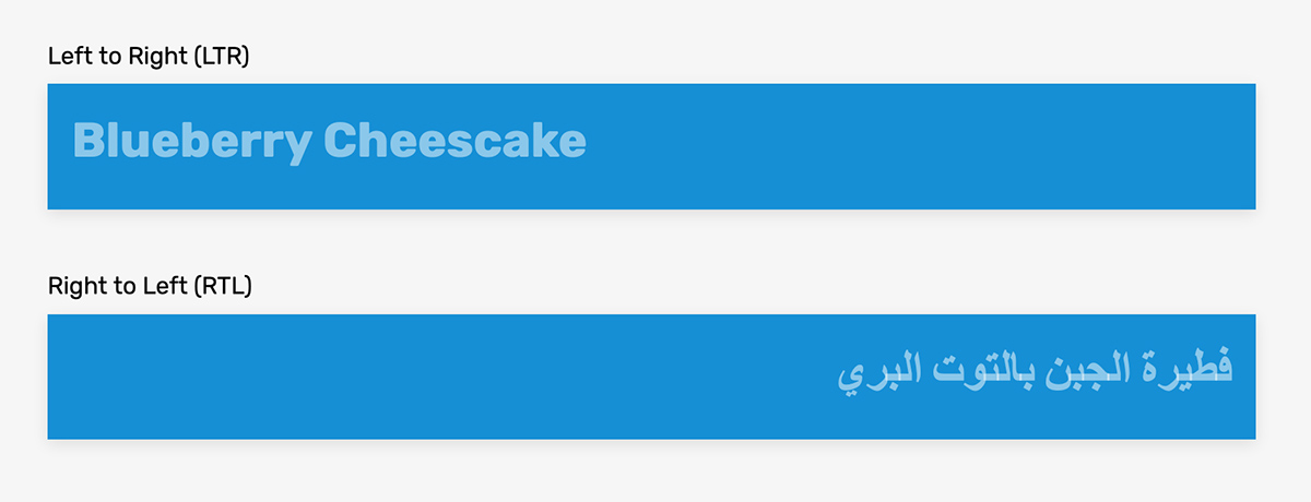
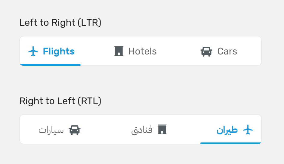
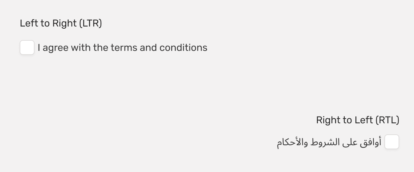
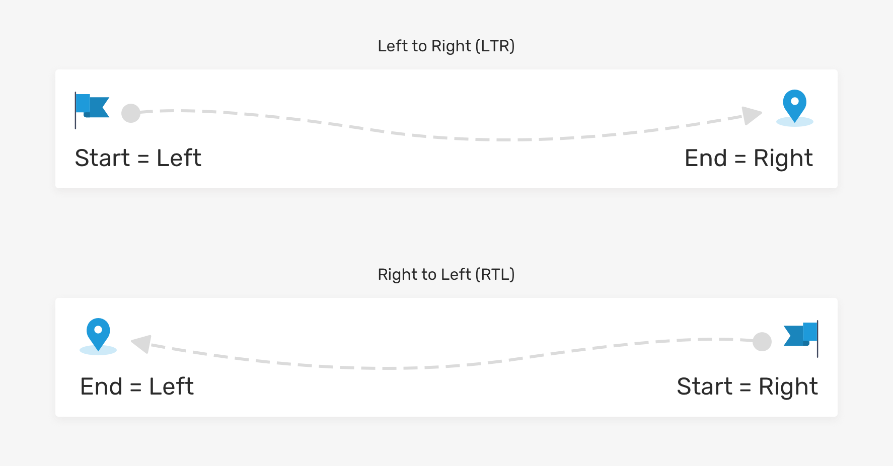
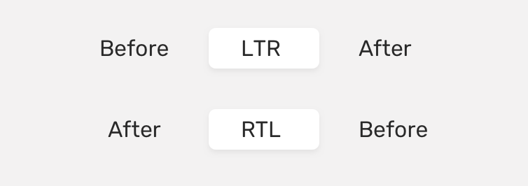
The default page direction in CSS is LTR. If you check the browser of your choice and inspect the browser’s default agent styles for the html element, you will notice that ltr is the default value for the dir (or “direction”) property. Below is a basic example to show the difference between an LTR and an RTL layout.
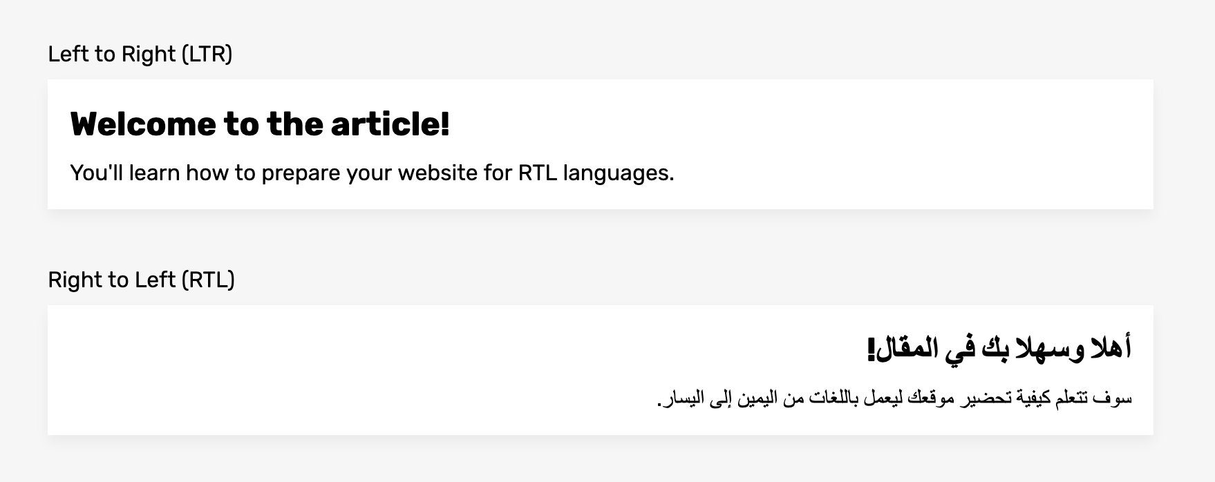
Notice for the RTL section, the text reads from right to left, which is the opposite of the LTR text. Luckily, the browser did all of the work for this simple example. To switch a document’s language direction, you will need to add the dir attribute to the root element.
<html dir="rtl">
  ...
</html>
When the dir is changed, the following elements should flip automatically: headings, paragraphs, links, images, and form elements.
It’s worth mentioning that there is a dir="auto" attribute, which switches the direction automatically based on the content parsed. According to the HTML specification:
Authors are urged to only use this value as a last resort when the direction of the text is truly unknown, and no better server-side heuristic can be applied.
See the Pen RTL Styling - Basic Example by Ahmad Shadeed (@shadeed) on CodePen.
In addition to setting the dir=rtl attribute on the HTML element, we may also add direction: rtl as a CSS style.
.element {
  direction: rtl;
}
However, the CSSWG recommends that the direction should be defined on the html root element to ensure the correct bidirectional layout in the absence of CSS.
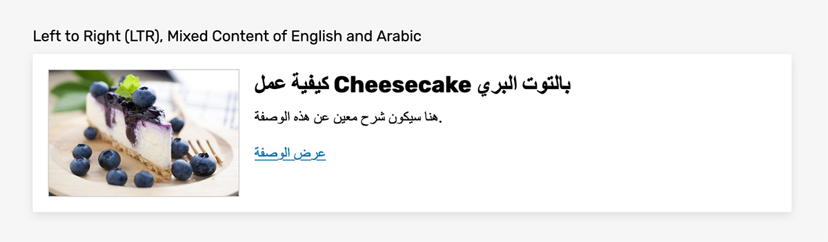
Basic Example of Flipping a Design #
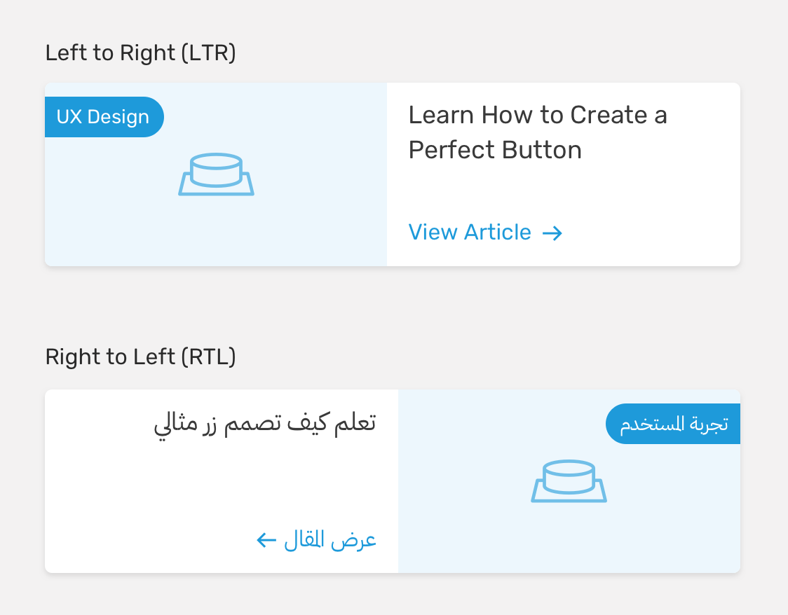
Let’s see a more detailed example to explore how to flip a design from LTR to RTL.
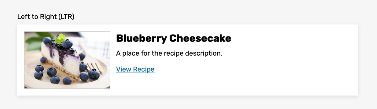
<article class="media">
<img src="blueberry-cheesecake.jpg" alt="" />
<div class="media__content">
<h2>Blueberry Cheesecake</h2>
<p>...</p>
<p><a href="#" class="link">View Recipe</a></p>
</div>
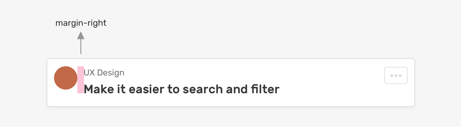
</article>Initially, I used the good old float to align the image to the left in the LTR design — and, of course, I used a clearfix.
.media:after {
content: "";
display: block;
clear: both;
}
.media__photo {
float: left;
width: 200px;
margin-right: 16px;
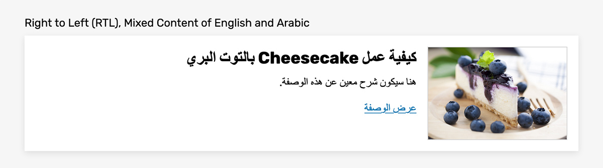
}After we add dir="rtl" for the Arabic element, the result looks like this:
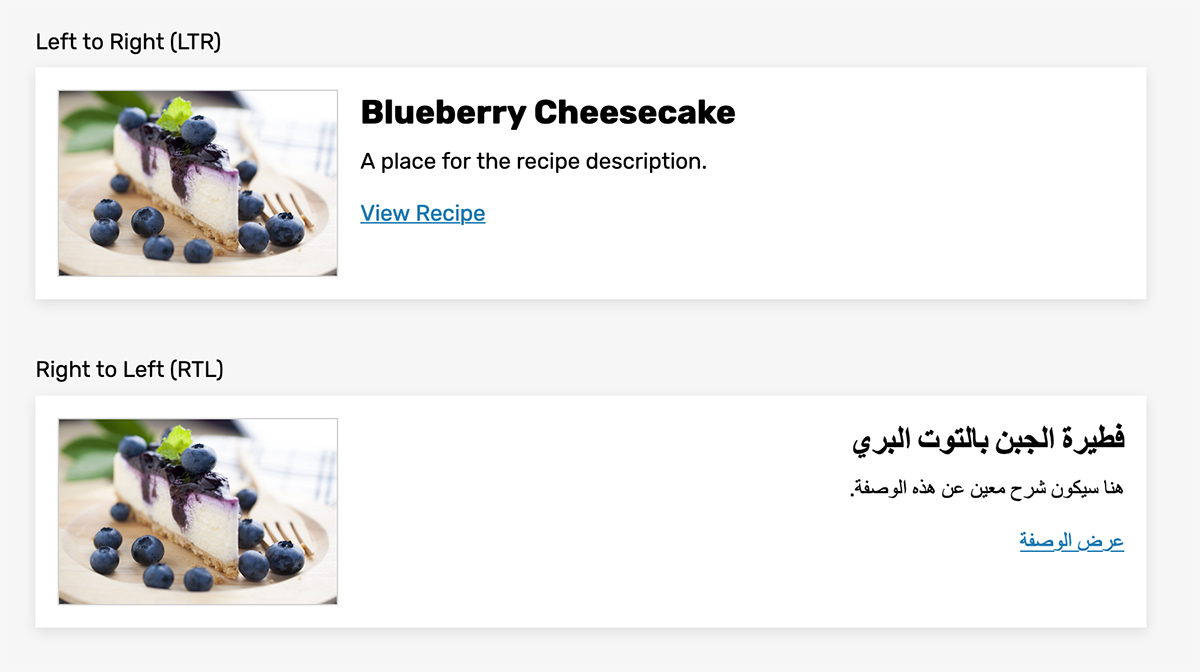
Everything is flipped except for the image. That’s because it has float: left and margin-right: 16px. To solve that, we need to override those styles:
.media[dir="rtl] img {
    float: right;
    margin-right: 0;
    margin-left: 16px;
}
See the Pen RTL Styling - Example 1 - Floats by Ahmad Shadeed (@shadeed) on CodePen.
Mixing English and Arabic Content in an LTR Layout #
What would happen if some text had a mix of English and Arabic words, while the layout was LTR? Well, the result would look weird.
The browser shows the title improperly. For an Arabic speaker, the title would be confusing to read, unless you’re the author who wrote it. It should read in the order shown in the figure below.

To avoid this issue, set the appropriate language direction whenever possible. Once dir="rtl" is set on the element, it will appear as expected.
See the Pen RTL Styling - Test by Ahmad Shadeed (@shadeed) on CodePen.
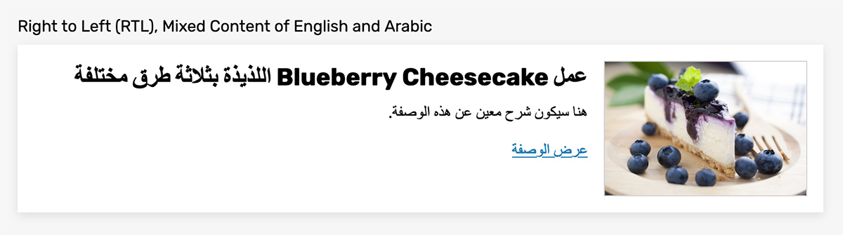
It can get more complex when the title is longer. Below, I’ve made the title a bit longer, and the result was unexpected. I’ve affixed numbers to show the correct order.
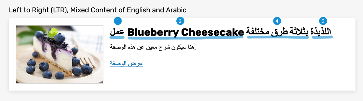
When dir="rtl is set on the element, the title is much clearer. That is, the sentence looks grammatically correct and in the right order.
See the Pen RTL Styling - Test 2 by Ahmad Shadeed (@shadeed) on CodePen.
Handling Fonts #
Based on the design for both LTR and RTL layouts, there should be a specific font for each direction. Some fonts can work for multiple languages, which are great. However, brands and businesses tend to use a different font for RTL.
To account for that, we should define a different font in the font settings of your project. See Automation Tools for more details.
Font Family #
In CSS, font-family works in a way that makes it easy to fall back to another font, in case a font didn't load. However, it turned out that if specific glyphs are not supported by the first font in the declaration, it will try to use the second font.
According to MDN:
Font selection does not simply stop at the first font in the list that is on the user's system. Rather, font selection is done one character at a time, so that if an available font does not have a glyph for a needed character, the latter fonts are tried.
Omar Bourhaouta made the following demo which proves the above concept:
See the Pen RTL font fallback by omar bourhaouta (@bourhaouta) on CodePen.
body {
  font-family: "Roboto", "Amiri", sans-serif;
}
The Roboto font didn't recongnize the Arabic glyphs, so it falled back to the second font declaration.
Flexbox Layout Module #
Flexbox is based on the writing mode of the document. The writing mode is used to specify how blocks are laid out on the page. For example, a Chinese website is laid out from top to bottom. The writing mode is for this purpose. In flexbox, items are distributed according to the writing mode of the document. The default value for writing-mode in English and Arabic is horizontal-tb.
According to Mozilla Developer Network (MDN), horizontal-tb means the following:
Content flows horizontally from left to right, vertically from top to bottom. The next horizontal line is positioned below the previous line.
When the page’s direction is changed to RTL, flexbox will flip its items accordingly. That’s a huge benefit! The illustration below shows how the flexbox axis is flipped based on the direction.
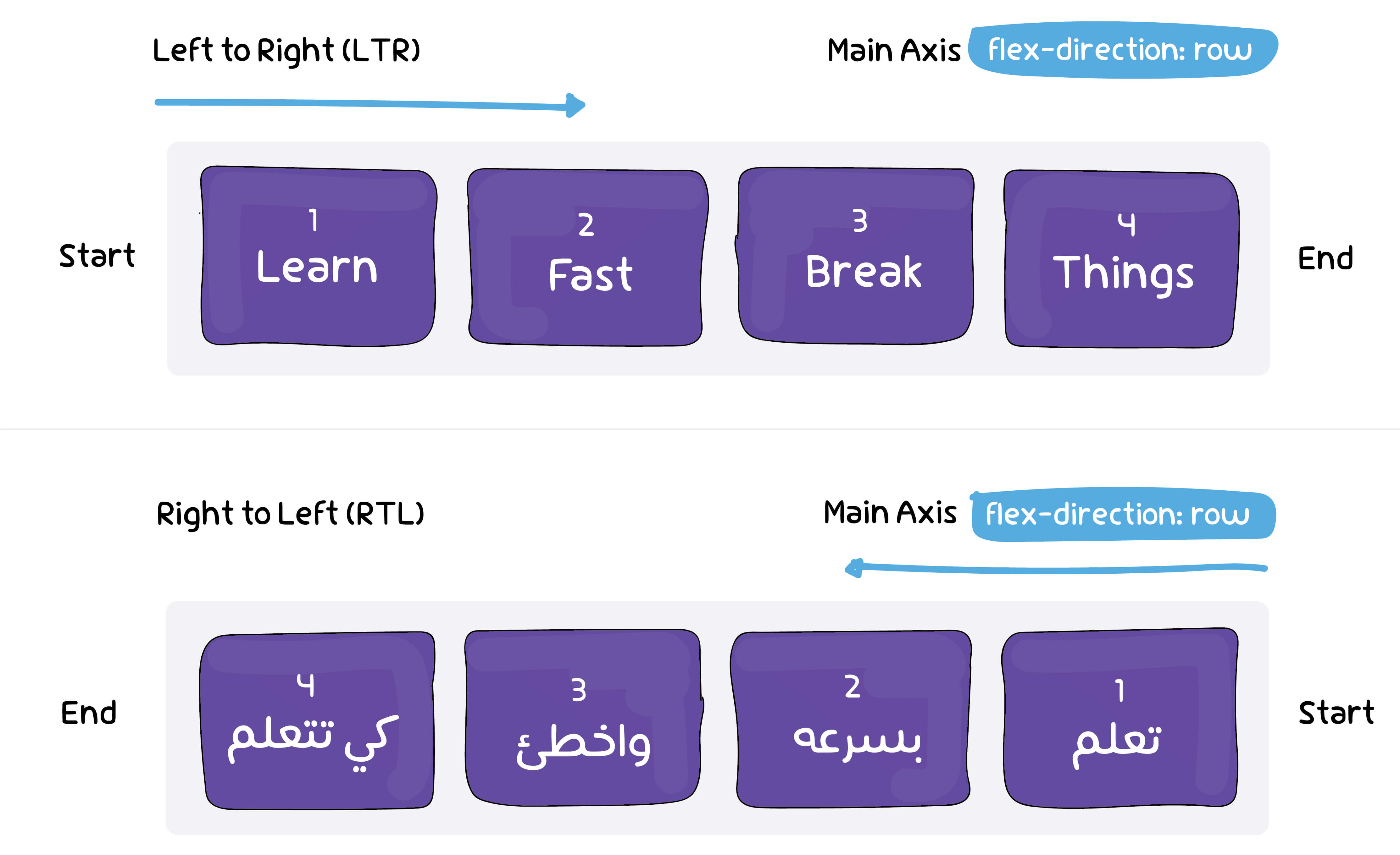
In the example below, I’ve laid out three items and numbered each of them to show the difference when the direction changes.
<div class="element">
  <div class="item">1</div>
  <div class="item">2</div>
  <div class="item">3</div>
</div>
.element {
display: flex;
flex-direction: row; /* Default value, added for clarity */
}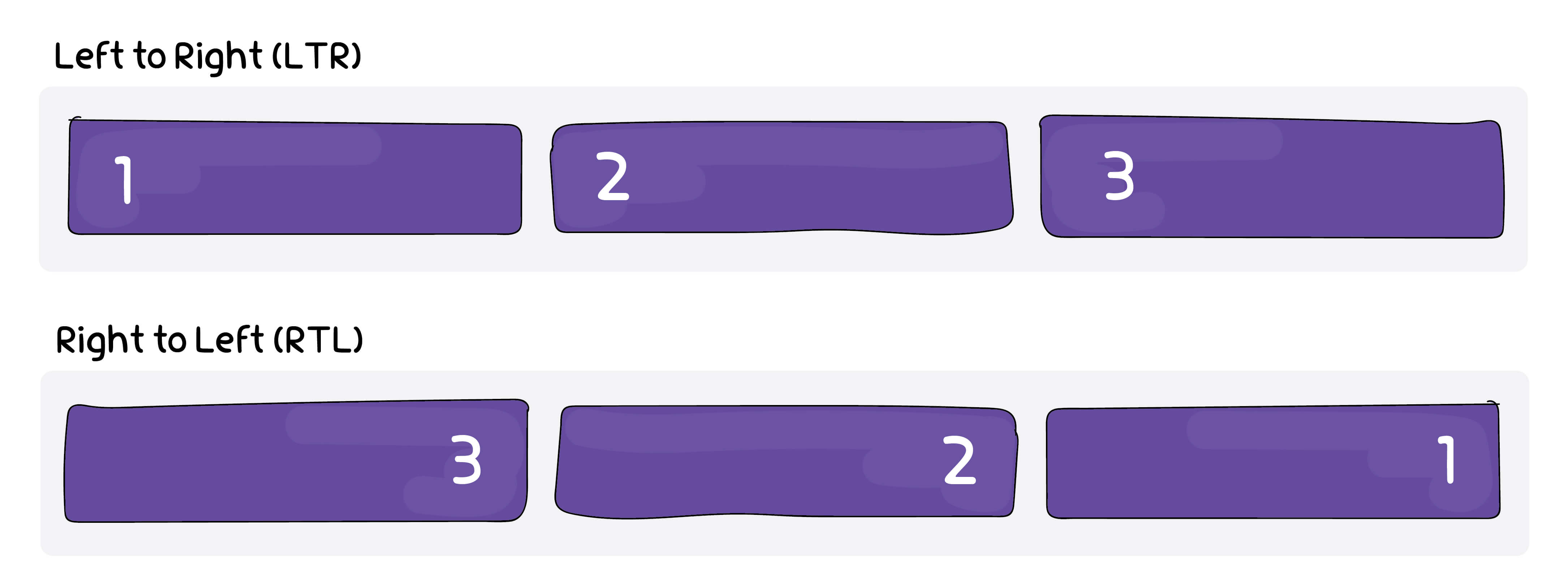
See the Pen RTL Styling - Test 3 by Ahmad Shadeed (@shadeed) on CodePen.
Grid Layout Module #
Like flexbox, the grid layout module depends on the writing mode of the document, which gives us the same benefit that we get from using flexbox.
In the example below, the sidebar should be on the left and the main content on the right when the direction is LTR. For RTL, it’s vice versa. When we use CSS grid, the flipping will be done automatically according to the page’s direction.
<div class="element">
  <div class="side">Side</div>
  <div class="main">Main</div>
</div>
.element {
display: grid;
grid-template-columns: 220px 1fr;
grid-gap: 1rem;
}See the Pen RTL Styling - Test 4 by Ahmad Shadeed (@shadeed) on CodePen.
Common Mistakes When Flipping to RTL #
Non-Arabic speakers make some common mistakes that are easy to spot.
1. Letter-Spacing #
In English, it’s common to add letter-spacing to adjust the letters of a word. It’s also known as tracking in typography. Consider the following example for English content. It looks normal.
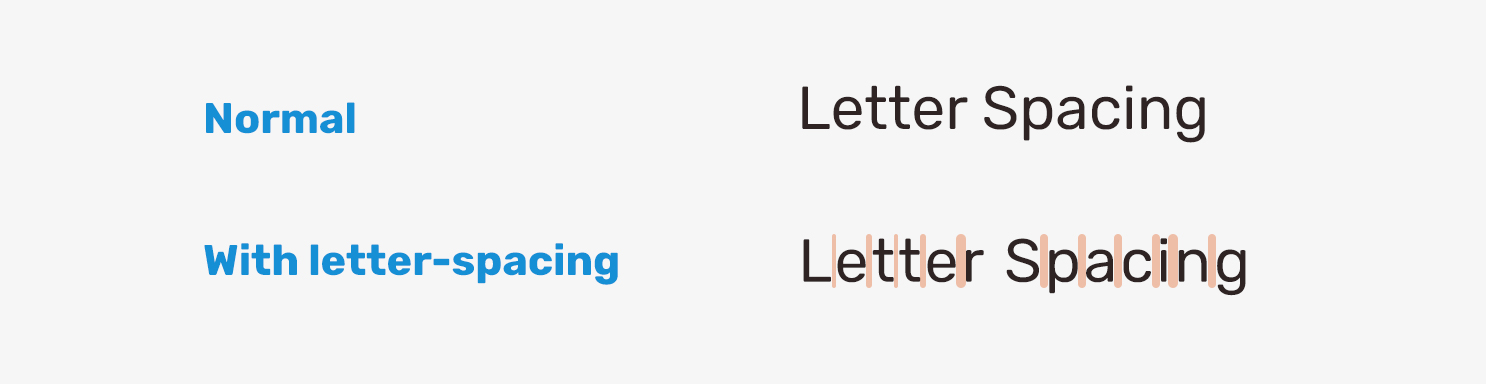
However, if the same letter-spacing style was added to Arabic content, it would look weird. Consider the following real-life example.
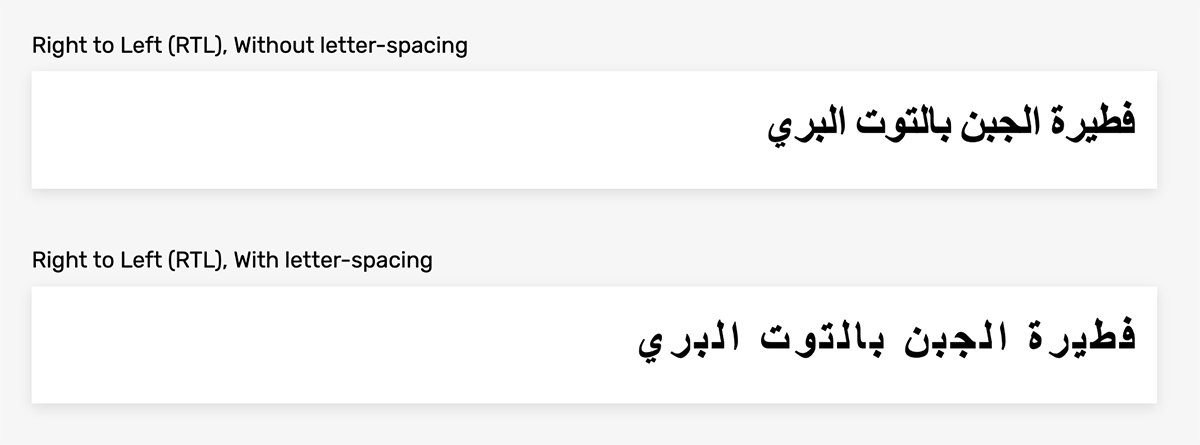
Notice that in the content with letter-spacing, each word’s letters look disconnected from each other. That’s not right. Arabic letters are supposed to look connected, and keeping the English letter-spacing works against that. Make sure to set letter-spacing: 0 when working on a multilingual layout.
See the Pen RTL Styling - Test 6 by Ahmad Shadeed (@shadeed) on CodePen.
2. Text Transparency #
It’s common to change the transparency of text color — to make it look secondary, for example. That works in English. However, when the content is Arabic, it causes a weird text-rendering issue.
There are some areas with a different color between letters. In this example, letter-spacing hasn’t been adjusted, so the issue is not related to that. The solution is simply to set the color without RGBa or opacity.
See the Pen RTL Styling - Test 7 by Ahmad Shadeed (@shadeed) on CodePen.
3. Differences in Word Sizes Between Languages #
Sometimes, when a website is translated into Arabic, the sizing of elements changes due to some words becoming bigger or smaller after translation. Consider the following example, in which I’ve mocked up the navigation of Smashing Magazine’s website.
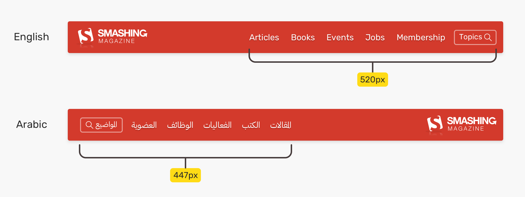
In the Arabic version, some of the words are almost the same size as their English counterparts, some are the same, and some are bigger. To make it clearer, here is a comparison of each word and its Arabic translation.
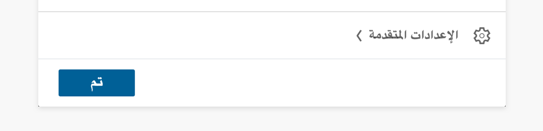
You might be wondering why I’m talking about differences in word sizes, since this is normal and expected. Consider the following real-life example from LinkedIn.
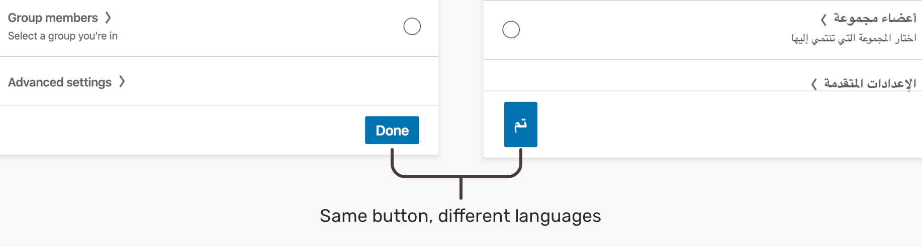
The button “Done” is translated to “تم” in Arabic, which makes the button too small and looks weird. It would be better to have a min-width for the button to account for such cases. I’ve added that in the browser’s developer tools to show how it’s meant to look:
And here is a very similar example from Twitter:
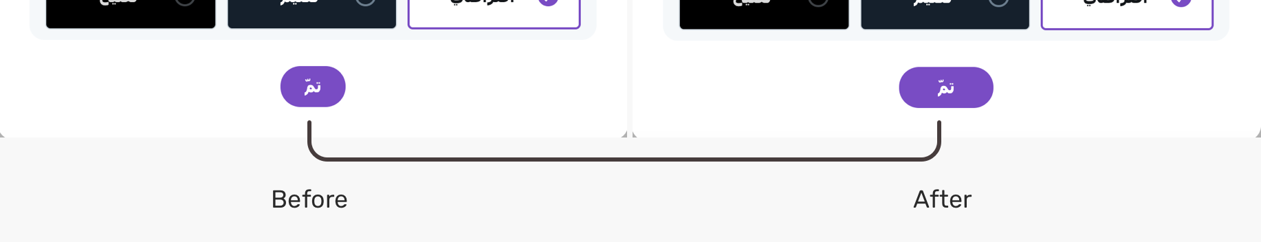
Please note that the issues above on LinkedIn and Twitter have been spotted by yours truly as of the time of writing (13 December 2019).
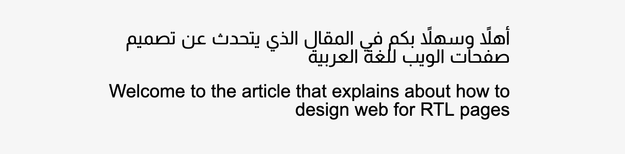
4. Text Truncation #
I once worked on a project with mixed content, and I faced an issue related to text truncation in the wrong direction. Consider the following example.
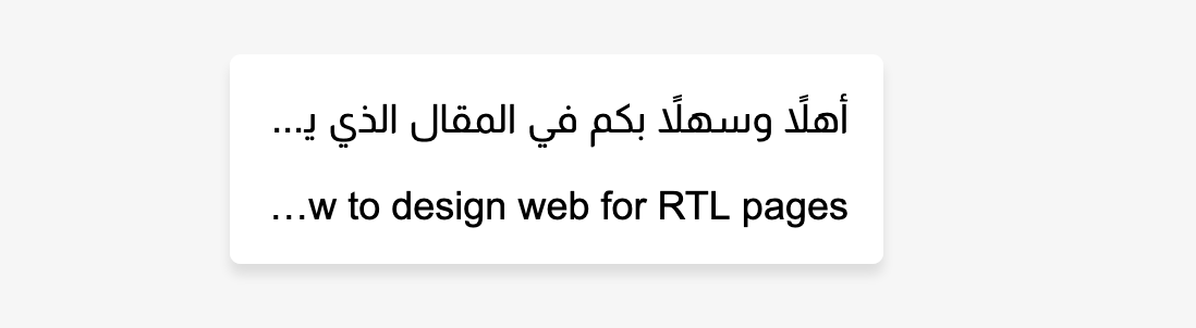
The truncation for the English text is incorrect. It should be at the end of the element, not the start of it. To solve that, set the attribute dir="auto" on the element itself, and then the browser will automatically parse the content and decide which dir it is.
<p dir="auto">
  أهلاً وسهلاً بكم في المقال الذي يتحدث عن تصميم صفحات الويب للغة العربية
</p>
<p dir="auto">
  Welcome to the article that explains how to design for RTL pages.
</p>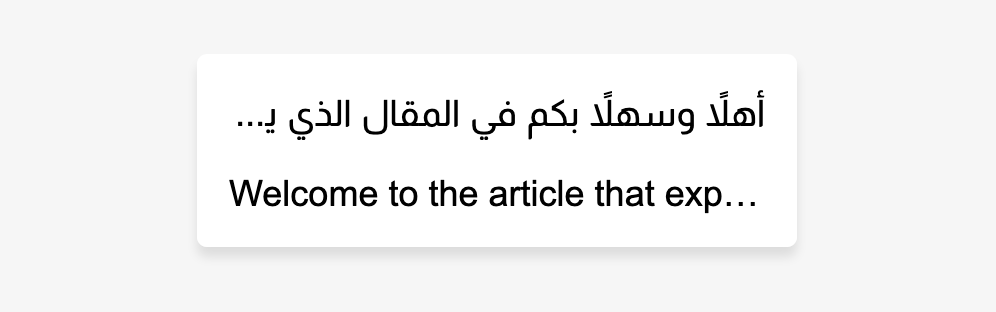
See the Pen RTL Styling - Truncation by Ahmad Shadeed (@shadeed) on CodePen.
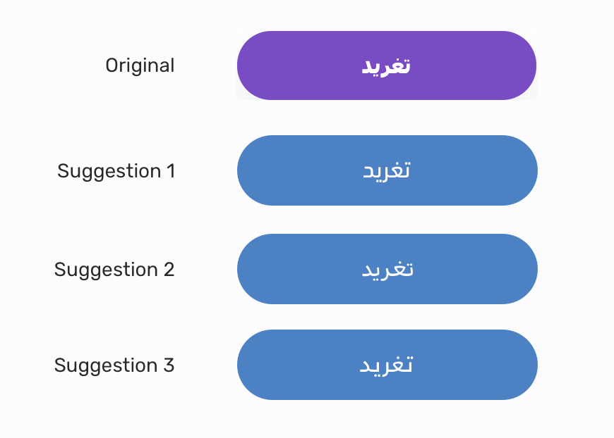
5. Picking a Bad RTL Font #
Having an RTL version of a design doesn’t mean you can pick the system’s default font and call it a day. The font has to be picked carefully to ensure good readability. An example of this is Twitter:
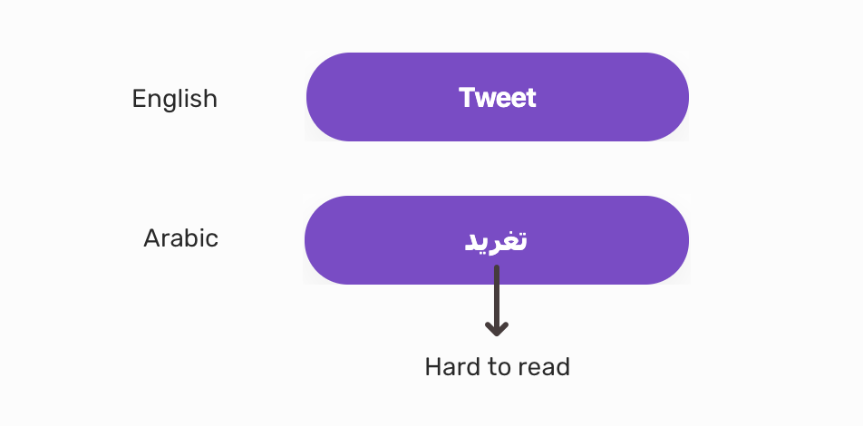
From an Arabic speaker’s point of view, the word “تغريد” is hard to read for a few reasons:
- The font is not good.
- The bold weight hinders readability.
- The word’s dots are small and really close to the letters.
I’ve mocked up a design that looks clearer:
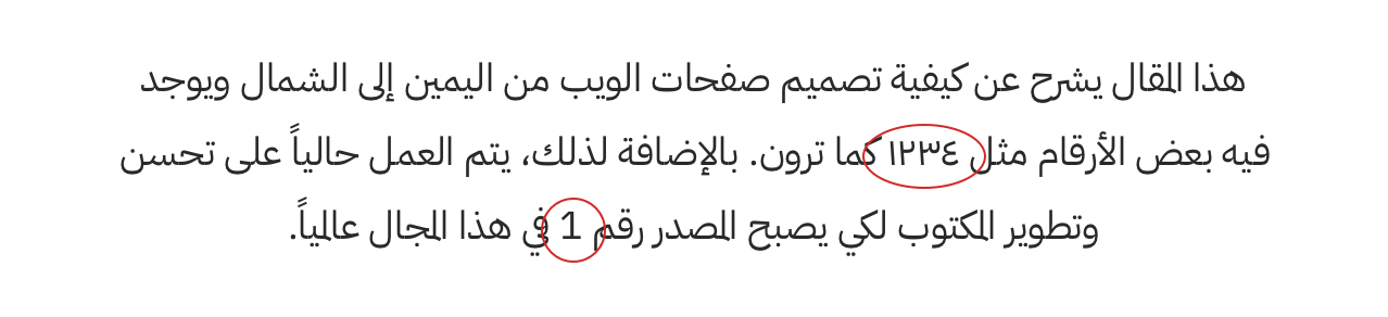
6. Mixing Hindi and Arabic Numerals #
In Arabic, there are two ways of writing numbers:
- Hindi: ٠ ١ ٢ ٣ ٤ ٥ ٦ ٧ ٨ ٩
- Arabic: 0 1 2 3 4 5 6 7 8 9
The numbers used in English are inherited from the Arabic ones: “0, 1, 2, 3, 4, 5, 6, 7, 8, 9”. Content that has numbers should be consistent, either Hindi or Arabic numerals.
According to Wikipedia:
The reason the digits are more commonly known as "Arabic numerals" in Europe and the Americas is that they were introduced to Europe in the 10th century by Arabic-speakers of North Africa, who were then using the digits from Libya to Morocco.
The following mockup has a mix of Hindi and Arabic numbers. It looks inconsistent, and it should look unified with one type of numerals.
Common Things That Might Not Work for RTL #
1. Line Height #
It’s common to set a different typeface for a RTL layout. In this case, test how the content looks on one and multiple lines. In the following example, the spacing between lines for the Arabic text is less than for the English one, even though both of them have the same line-height.
It’s important to account for this and to provide a suitable line-height for the Arabic content.
See the Pen RTL Styling - Test 8 by Ahmad Shadeed (@shadeed) on CodePen.
On Twitter, for example, there is a button with cut-off content due to an unsuitable value for line-height.
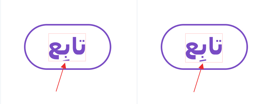
Notice that in the first image, an Arabic diacritic is cut off. It’s called the “kasra”, and it’s vital for reading the word correctly. In the adjoining image, I’ve fixed the line height, and now it appears in full without being cut off.
2. Underlined Links #
The default text underline looks bad when used with Arabic words. This relates to how words and letters are written in Arabic. See the following illustration:
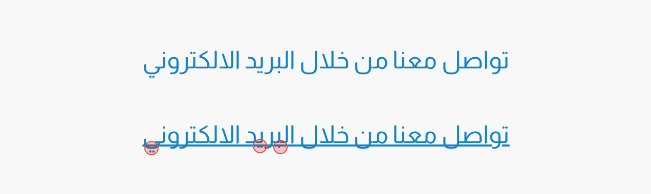
I’ve highlighted the weird areas with a red circle. The underline is kind of covering the dots of the letters. Still not clear? Here is a close-up:
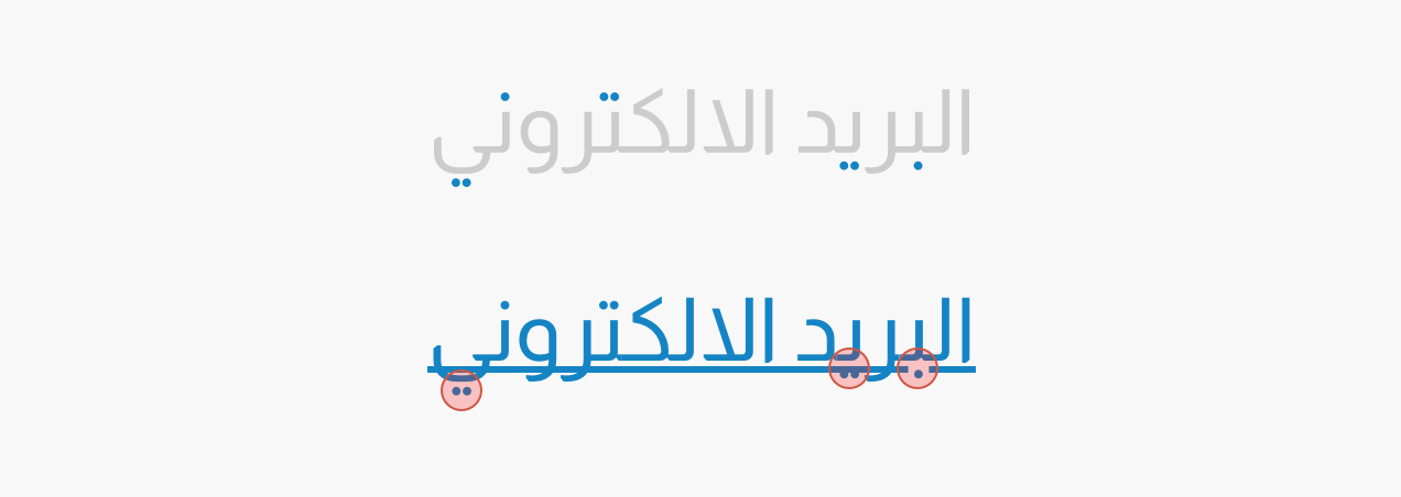
The dots highlighted in blue overlap with the underline. This is not good, and it makes the text hard to read. The solution is to use a custom underline with CSS.
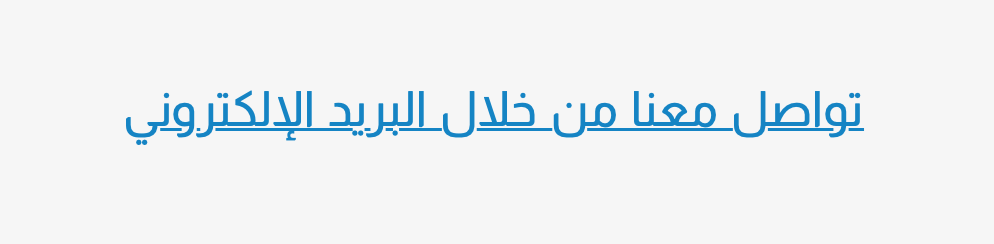
2.1. Text Decoration #
It’s possible to change the underline’s style and color with the new text-decoration-style and text-decoration-color properties. However, it is not guaranteed to work with all typefaces and font sizes. At the time of writing, Firefox is the browser that has the best support for these properties.
Update: 18 Jan 2020
Based on this issue on Github, it turned out that using text-decoration-skip-ink property can solve the issue of dots overlapping with the underline. The default value for it is skip.
See the Pen RTL Styling - Text Decoration by Ahmad Shadeed (@shadeed) on CodePen.
At the time of writing, it's not supported in Safari, old Edge (The chromium Edge supports it). Here is how it looks in Safari:
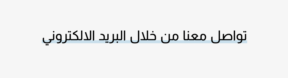
2.2. Box Shadow #
Browser support for box-shadow is much better than for text-decoration. It’s possible to detect support for one of the new text-decoration properties, and if the browser does not support it, then it will fall back to the box-shadow property.
.link-3 {
  color: #000;
  text-decoration-color: rgba(21, 132, 196, 0.2);
  text-decoration-style: normal;
  text-underline-offset: 4px;
  text-decoration-thickness: 2px;
  box-shadow: inset 0 -5px 0 0 rgba(#1584c4, 0.2);
}

@supports (text-decoration-color: red) {
  .link-3 {
    box-shadow: none;
  }
}
3. Line Break #
If your CSS has the word-break property, you’ll need to test it because it might break Arabic words. Consider the following:

The circled areas are broken Arabic words due to the effect of word-break. In Arabic, there is no such thing as word breaks. The letters of a word are connected with each other, so it’s not possible to break a word.
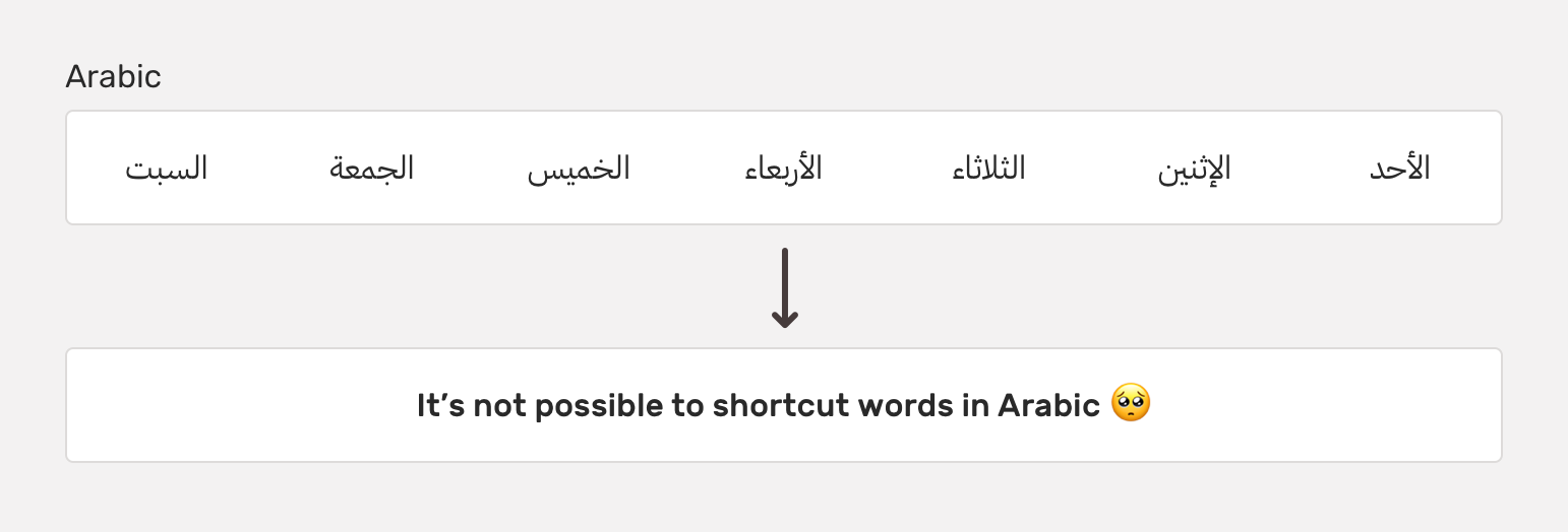
4. Abbreviations #
In English, it’s common to use abbreviations for, say, the days of the week. So, “Saturday” becomes “Sat”.
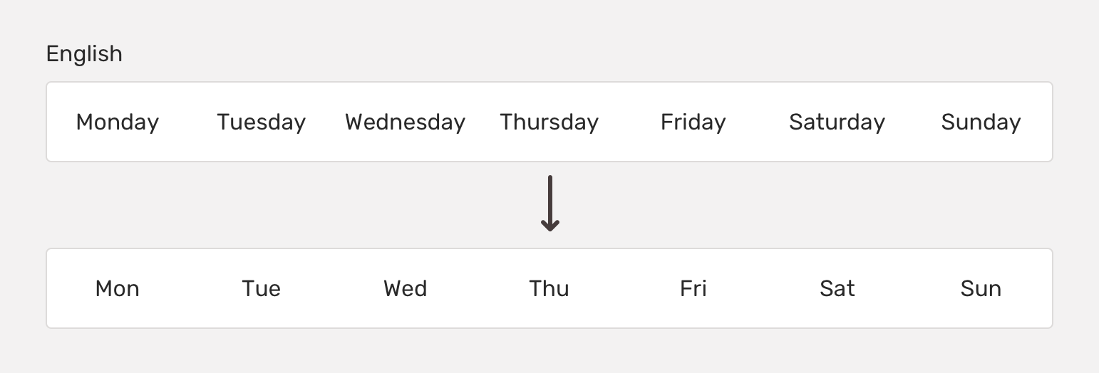
In Arabic, this not possible at all because a word’s letters are meant to be connected.
Bidirectional Icons #
Symmetrical icons don’t need to be flipped between LTR and RTL layouts. Here are some examples:
For some icons, though, it’s important to flip their direction in RTL layouts, so that they can be clearly understood by the user.
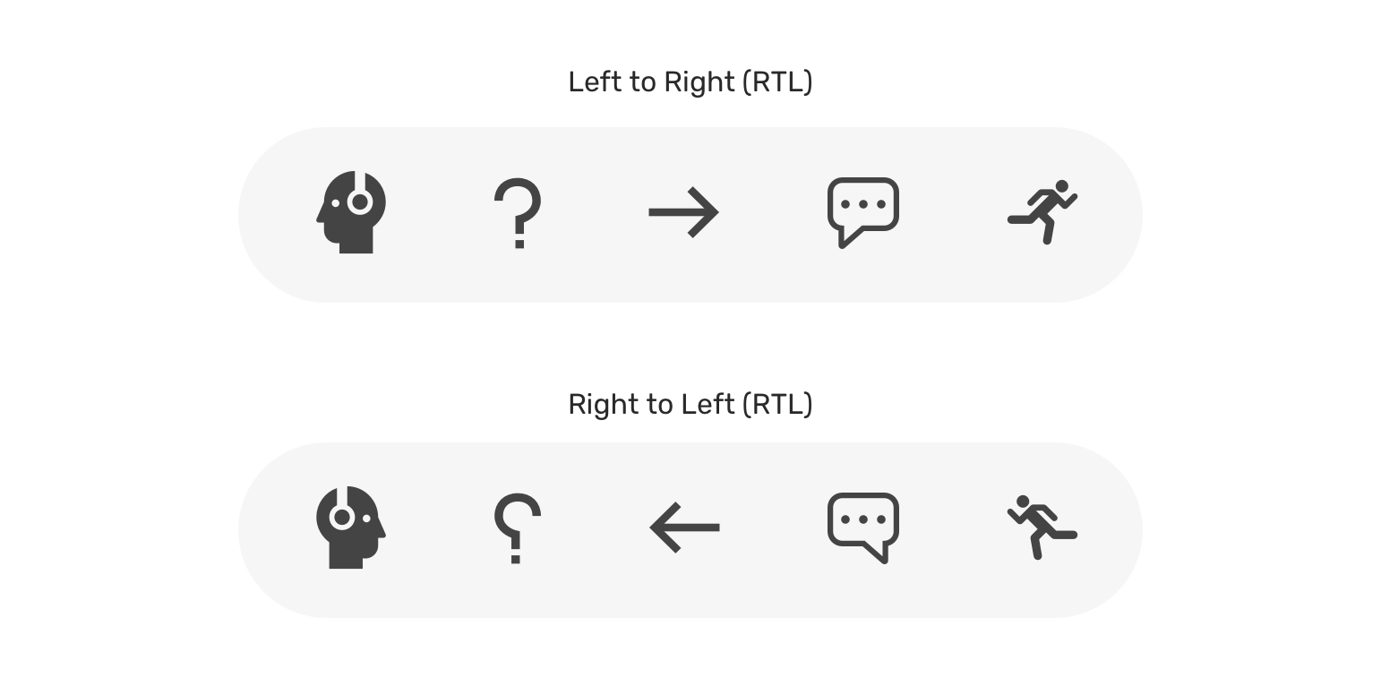
However, there are always exceptions. As per the material design guidelines, if an icon represents an object that can be held with a person's right hand, then it doesn't need flipping. Here are some examples:
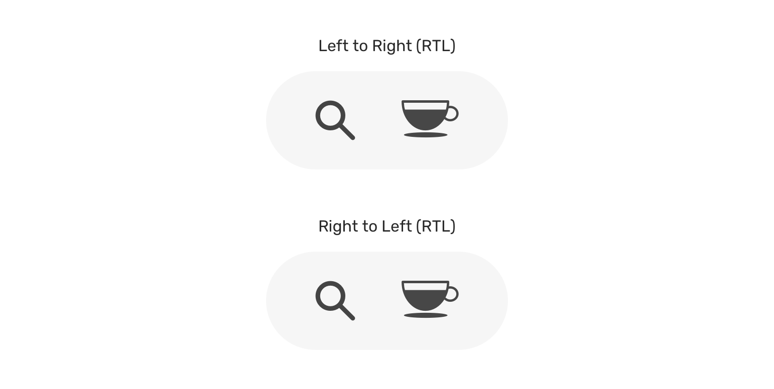
Media Player Icons #
I went back in time for about 15 years ago when my dad got me an MP3 player. It has a play button, and its direction points to the left.
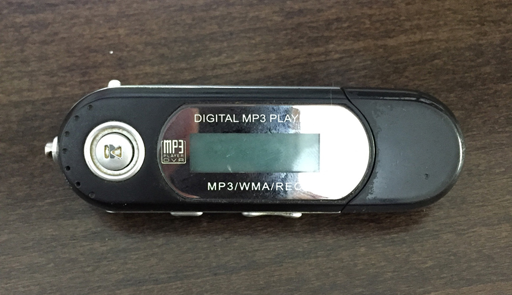
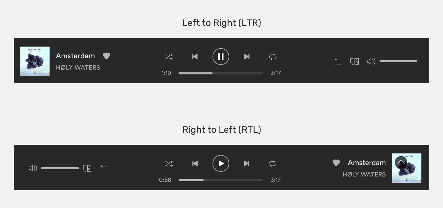
Some icons are universal, and it doesn't require us to flip them. The reason is that because those playback buttons represent the direction of the tape being played, not the direction of the time. Here is how Spotify app looks in English and Arabic:
Notice that the playback icons are not flipped since they are universal icons.
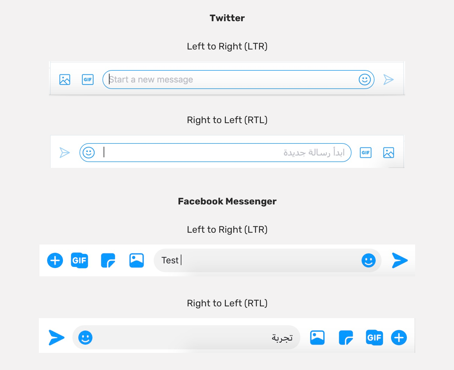
Messaging Apps #
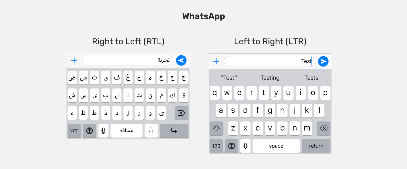
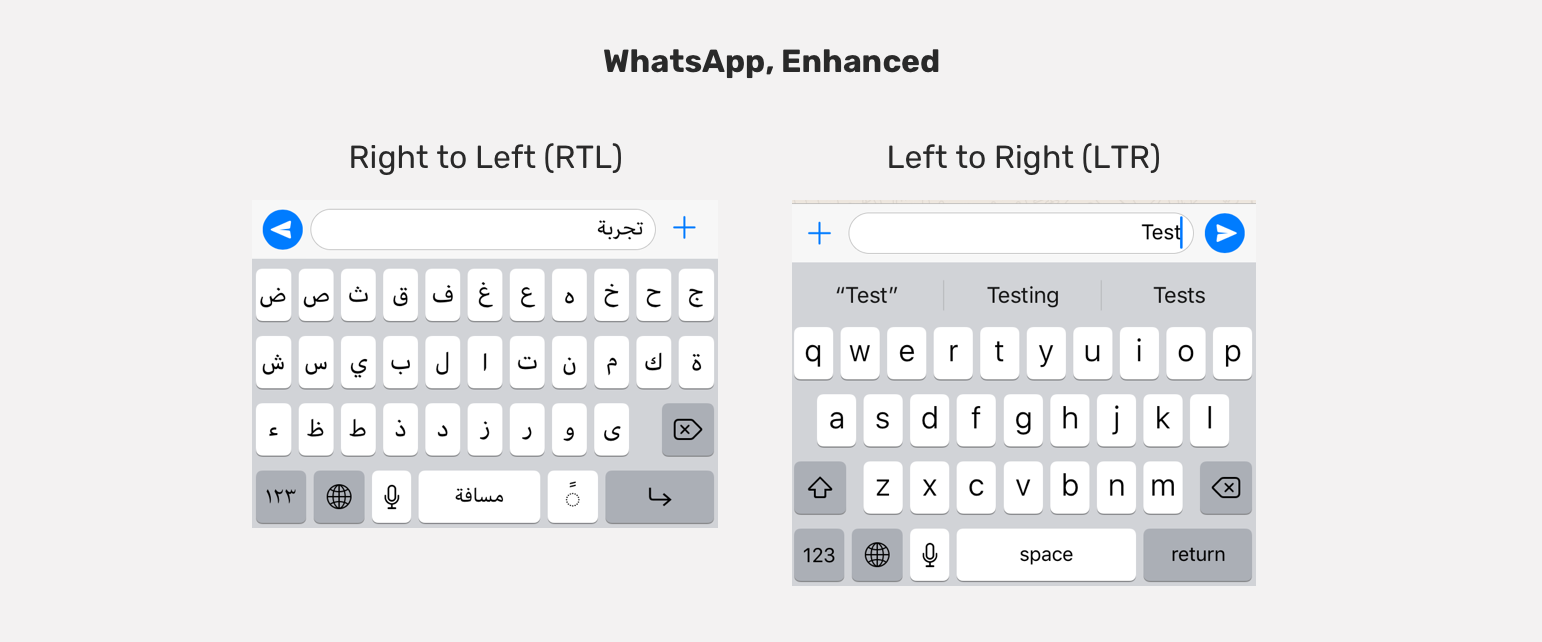
In an interesting Twitter discussion, I got asked about whether to flip the send icon of a messaging app or not. I did some research for Facebook Messenger, WhatsApp, and Twitter.
The send icon is flipped, and in my personal opinion, this is the correct thing to do as it feels more logical for me. Adding on that, the position of the send and "+" buttons should be flipped to make it more correct. See below mockup:
On the other hand, neither Facebook nor Twitter did flip the send icon.
Flipping Components #
While working on some components, I need a way to quickly flip them. In the Sketch app, I’ll copy a component and then flip it with the “flip” command. The same functionality is available in Adobe XD and Figma.
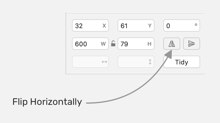
To see what I mean, here is a GIF showing what I did after flipping a component.
RTL Design Considerations #
In this section, I’ll go through the most common components and show how they should look in RTL mode.
Button Icons #
It’s common to have a button with an icon that opens a menu for more actions. In this case, the icon’s position should be flipped in the RTL layout.
Form Inputs #
Some form inputs should remain left-aligned in RTL — for example, email and mobile-number inputs.
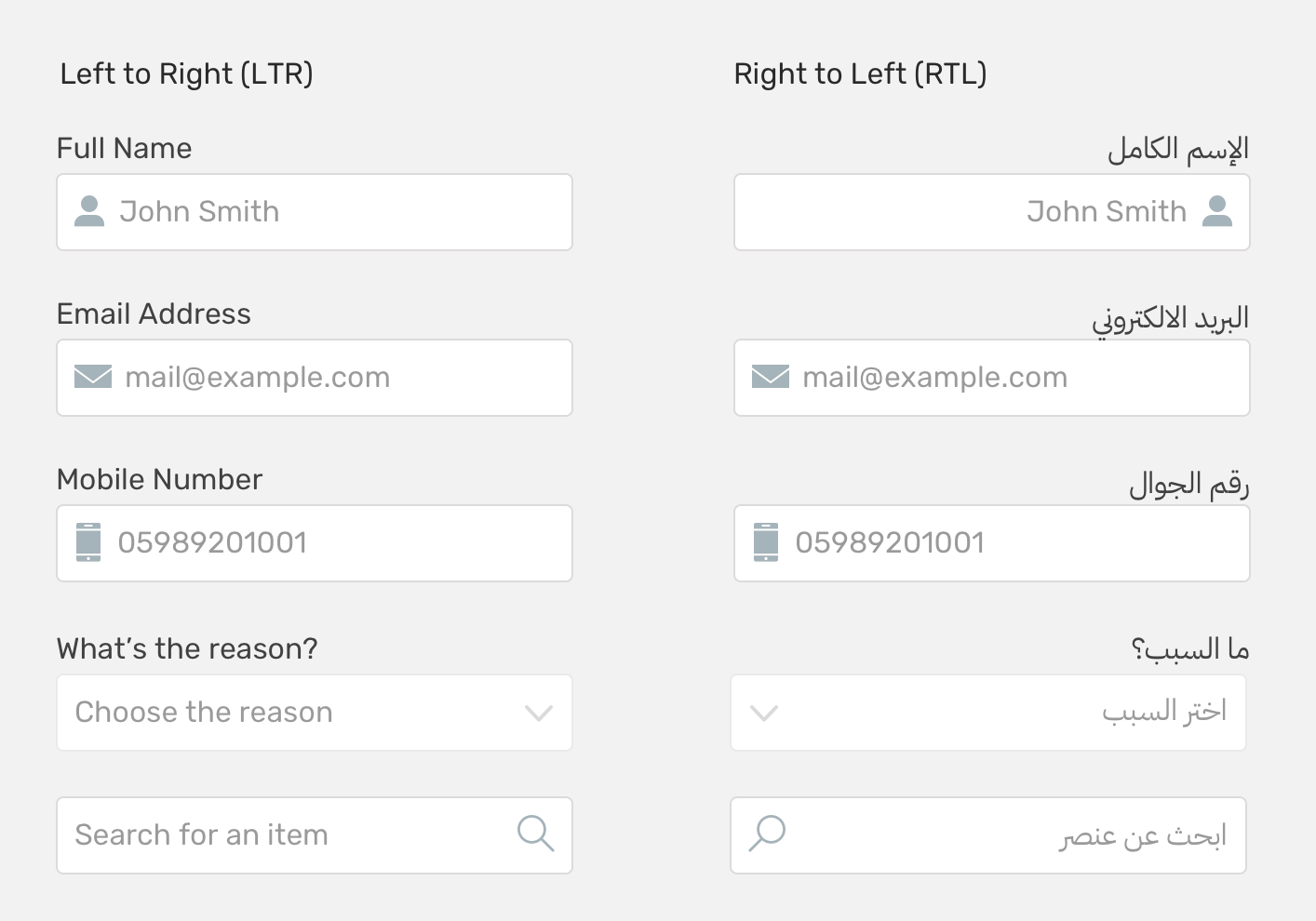
It's worth noting that if the placeholder content is in Arabic or other RTL language, then the placeholder should be aligned to the right. Once the input is focused and the user starts typing, the alignment will be flipped to the left.
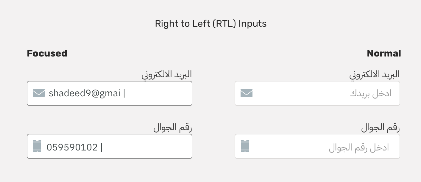
Thanks to YuanHao Chiang for letting me know about the use-case above.
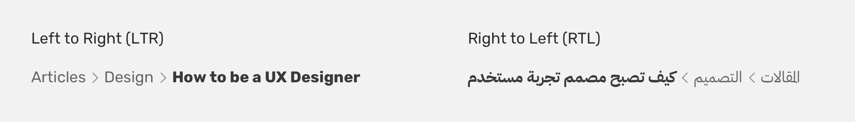
Breadcrumbs #
The arrows in the breadcrumb pattern should be flipped, too.
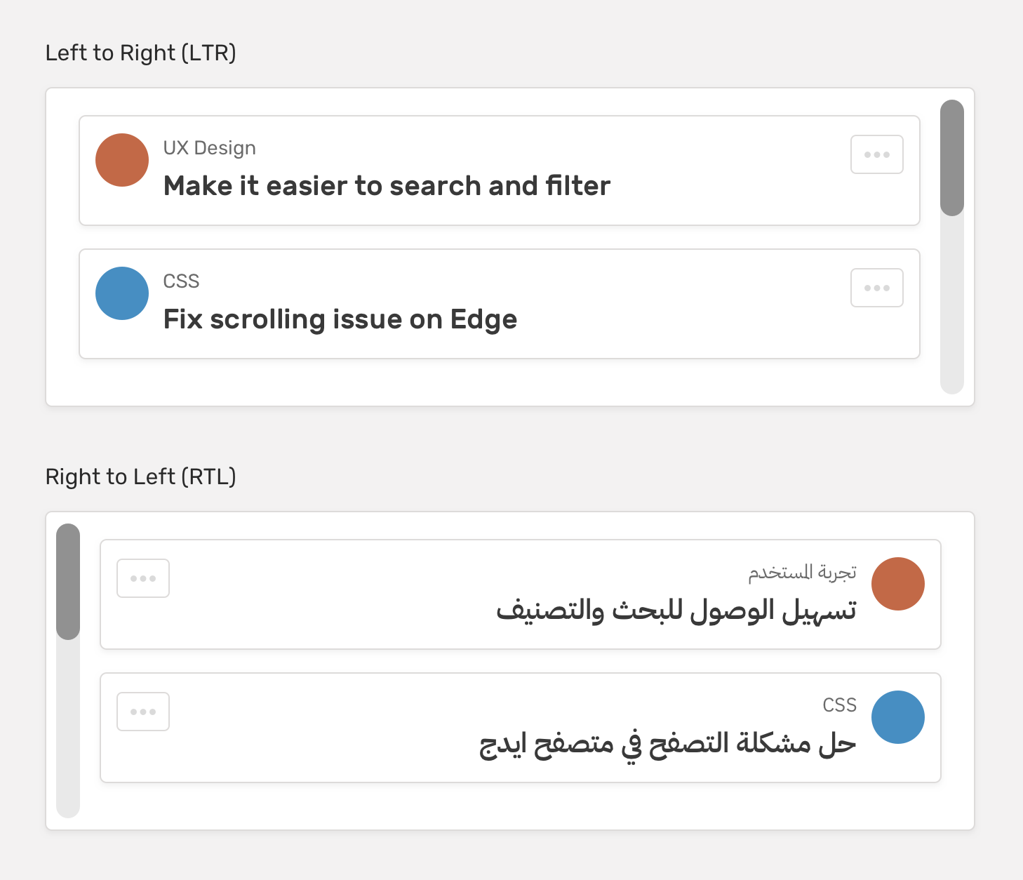
Page Header #
A page header component contains start and end sections. Each one of them should be flipped in RTL.
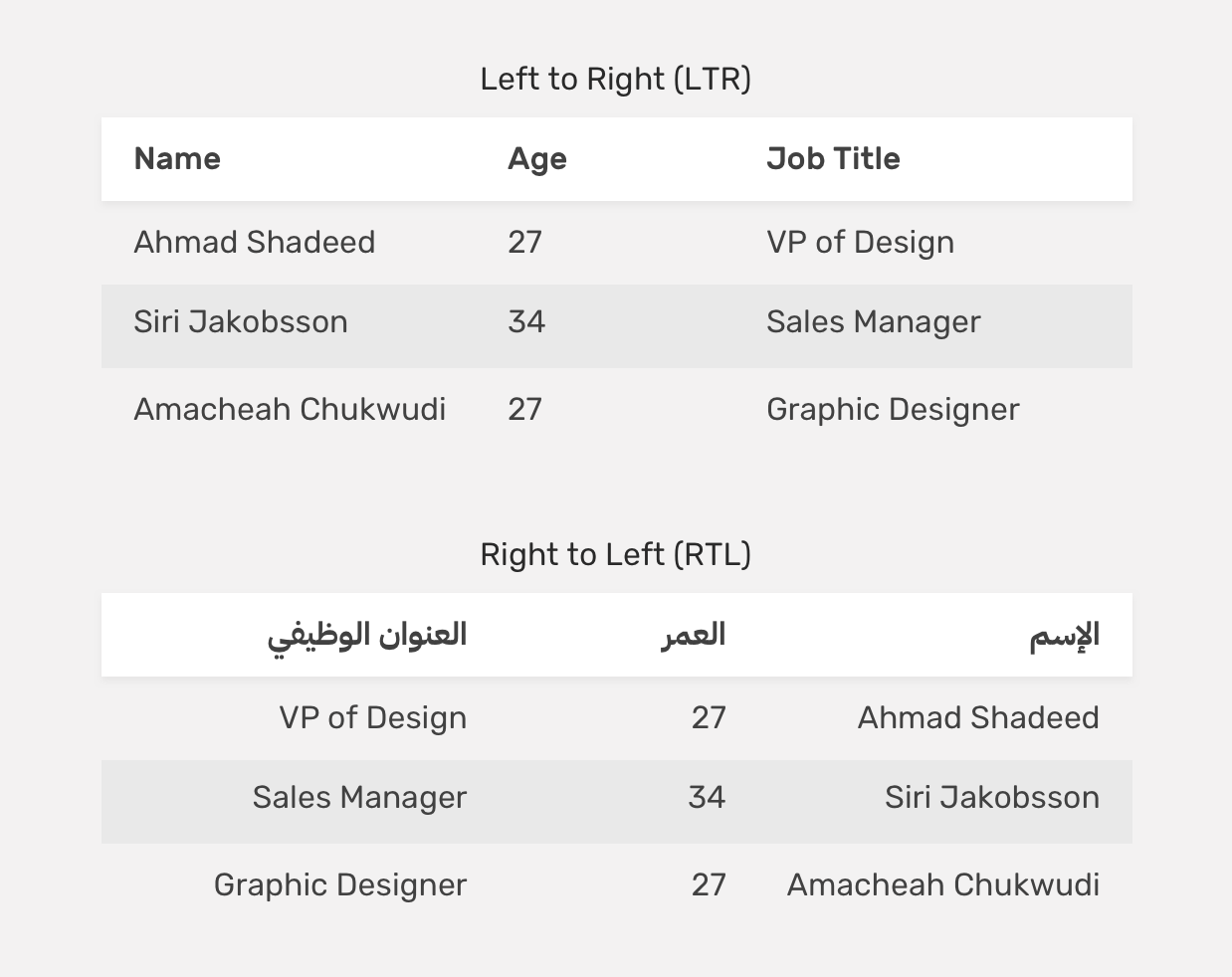
Tables #
A table should also be flipped.
Tabs #
For a tabs component in LTR, the icons would be to the left of the label. In RTL, these should be flipped.
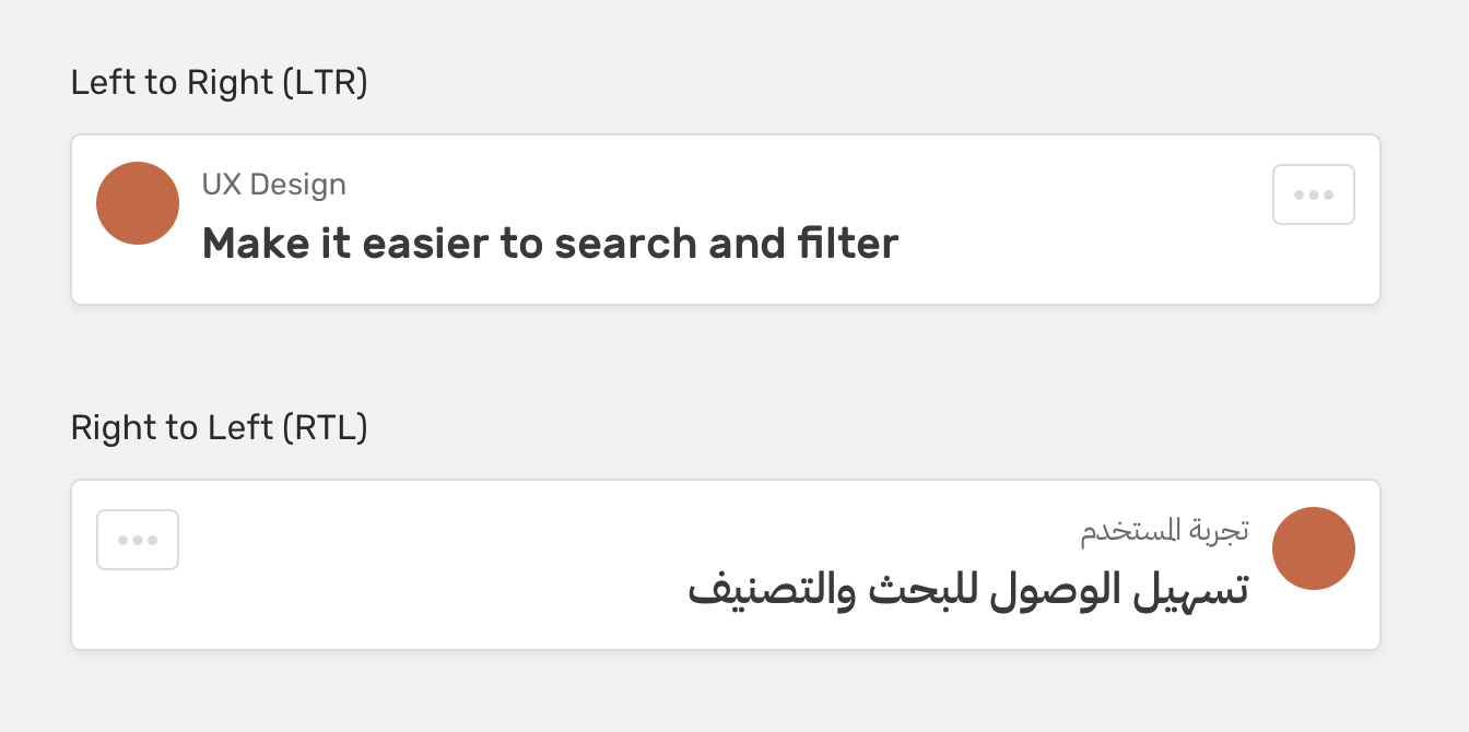
Card #
For a horizontal card, the order of the image and the text should be flipped in RTL.
Toasts #
As you might expect, “close” and warning icons should flipped.
Blockquotes #
The icon should be flipped as in the mockup below.
Toggle switches #
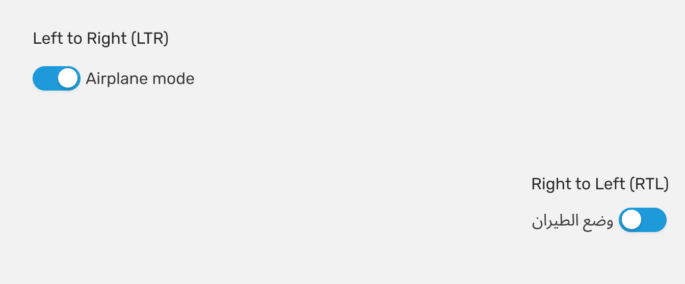
If we go back to the basics, a toggle switch is similar to a checkbox, so should they flip? The answer is yes.
Consider the following example.
We have a checkbox. When the layout is RTL, it's flipped.
The same concept applies to the toggle switch. Whatever the UI was in the LTR, it should flip in RTL.
CSS Logical Properties #
According to MDN:
CSS Logical Properties and Values is a module of CSS introducing logical properties and values that provide the ability to control layout through logical, rather than physical, direction and dimension mappings.
Let’s take a simple example. Suppose we need to align a string of text to the left. So, we add the following:
.page-header {
  text-align: right;
}
And for the RTL:
[dir="rtl"] .nav-item {
  text-align: left;
}
What if there was a way to add one text-align value that changes the direction based on the page’s direction? CSS logical properties to the rescue!
.page-header {
  text-align: end;
}
By having this, the direction of text-align will be based on the page. Demo
To make it easy to see the difference between start and end, I’ve made the mockup below. The start value is equal to left in LTR, and end is equal to right in RTL. The same applies for end as well.
Now that you’ve got a basic idea of how it works, let’s explore more examples and use cases for CSS logical properties.
Logical Padding #

Suppose we have a search input, with a search icon on the right. We should add padding on both the left and the right. The padding on the right would be a bit bigger to prevent the text from dropping below the search icon.
.input--search {
  padding-inline-start: 1rem;
  padding-inline-end: 2.5rem;
}
Logical Margin #
The margin on the right side of this icon needs to be logical, so we’ll use margin-inline-start for that.
.page-header__avatar {
  margin-inline-start: 1rem;
}
Logical Borders #

Often times, you might need to add a border to indicate that a navigation element is active. In the design above, there is a border on the left side of each navigation element. How do we make it logical?
.nav__item {
  border-inline-start: 3px solid transparent;
}

.nav__item.is-active {
  border-color: #1e9ada;
}
Logical Border Radius #

In the design above, the navigation element’s background has a border radius only for the top-right and bottom-right corners. In order to do that logically, we use the following:
.nav__item {
  border-start-end-radius: 30px;
  border-end-end-radius: 30px;
  background-color: transparent;
}

.nav__item.is-active {
  background-color: #ecf6fb;
}
Logical Properties Cheat Sheet #
When in doubt about the logical equivalent of a directional CSS property, use the cheat sheet below. Please note that the properties included are limited to what is useful for LRT and RTL. I made it based on a great article by Adrian Roselli.
See the Pen CSS Logical Properties by Ahmad Shadeed (@shadeed) on CodePen.
Adding on that, Adrian created a demo that makes it easy to understand the difference between a logical and a directional CSS property.
See the Pen Logical Properties Mapping by Adrian Roselli (@aardrian) on CodePen.
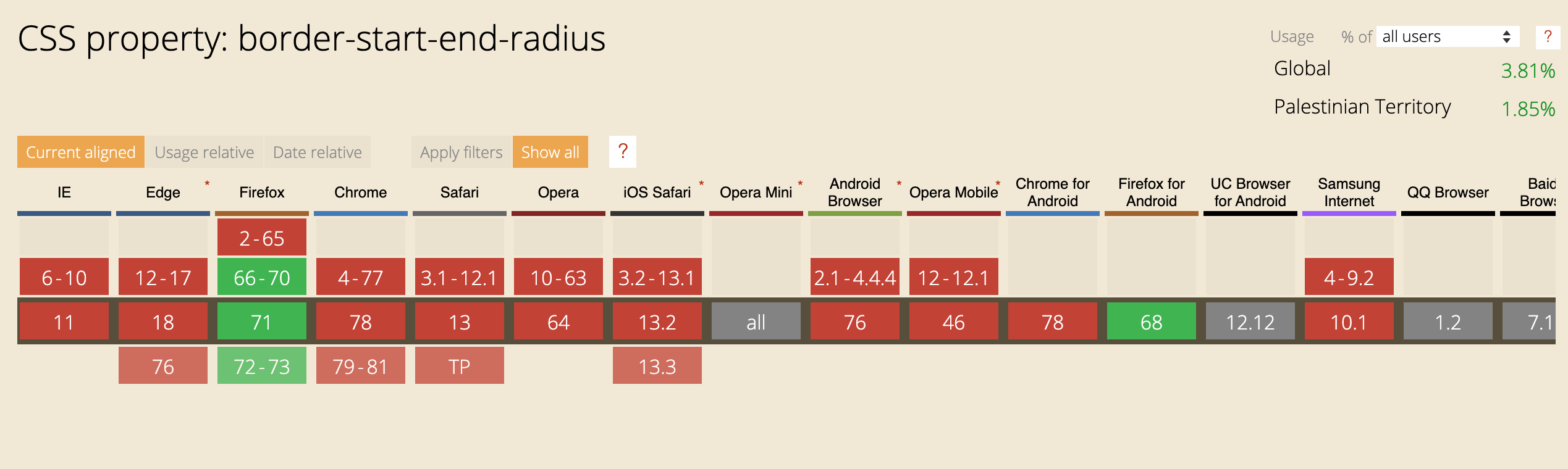
Browser Support #
Browser support is quite good for padding, margin, and text-align. However, it’s not good for the border-radius properties. Here are the support tables from Can I Use:
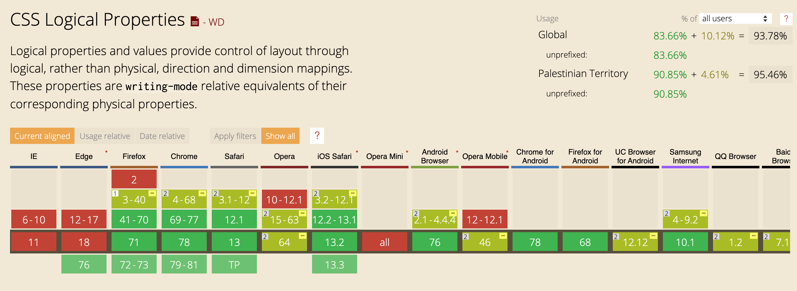
Even though support is not perfect (and it won’t ever be perfect), I advise you to use CSS logical properties with fallbacks. For example:
.input--search {
  padding-left: 1rem;
  padding-right: 2.5rem;
  padding-inline-start: 1rem;
  padding-inline-end: 2.5rem;
}
Also, you can use the PostCSS Logical plugin, which adds a fallback for each logical property used.
CSS Naming Conventions #
In general, avoid giving CSS classes names that are tied to their elements. Use names that can be extracted to reusable components. Consider the following:
<div class="c-section">
  <p><a href="#" class="see-link">See more</a></p>
</div>

<div class="c-section">
  <p><a href="#" class="see-link">Learn more</a></p>
</div>
In both sections, the links are the same but their labels are different. In the second section, see-link doesn’t make sense. A good name might be c-link. The c stands for component, which I learned from the ITCSS framework.
Now that you’ve got the idea, we can apply it to RTL styling as well. The design mockup below has a section with two children.
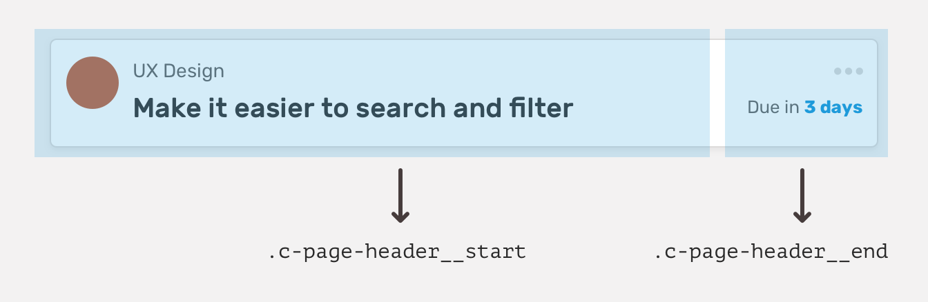
Instead of giving the elements presentational names, like .c-page-header__left and .c-page-header__right, I’ve named them .c-page-header__start and .c-page-header__end. This is more future-proof and doesn’t assume that the website is only LTR or only RTL.
Bidirectional Vertical Scrollbars #
To my knowledge, the vertical scrollbar direction inside a container in CSS changes based on the page direction. For an RTL layout, the scrollbar direction is on the left, and for LTR, it's on the right.
Consider the below figure.
However, for operating systems, the browser's scrollbar doesn't change and it stays on the right side no matter the OS language. But for the operating system itself, the scrollbar changes depending on its language.
Automation Tools #
Great tools exist to make our job easier when we need to flip a design from LTR to RTL.
1. Bi-App-Sass #
Bi-App-Sass by Anas Nakawa lets you write style sheets once, and then it compiles them to two different style sheets, one for LTR and the other for RTL.
This tool would be useful for a large project. The result would be multiple style sheets for each language direction. Consider the following:
.elem {
  display: flex;
  @include margin-left(10px);
  @include border-right(2px solid #000);
}
The resulting CSS would be this:
app-ltr.css
.elem {
  display: flex;
  margin-left: 10px;
  border-right: 2px solid #000;
}
app-rtl.css
.elem {
  display: flex;
  margin-right: 10px;
  border-left: 2px solid #000;
}
Note, however, that the last commit in the GitHub repository was four years ago (November 2015).
2. RTLCSS #
RTLCSS by Mohammad Younes is a framework for converting LTR style sheets to RTL.
The difference with this tool is that it only runs on the build version of a CSS file. For example, if you have a project with 50+ Sass components, RTLCSS will come in handy for parsing the compiled CSS file and creating an RTL version of it.
Practical Examples #
Website Header #
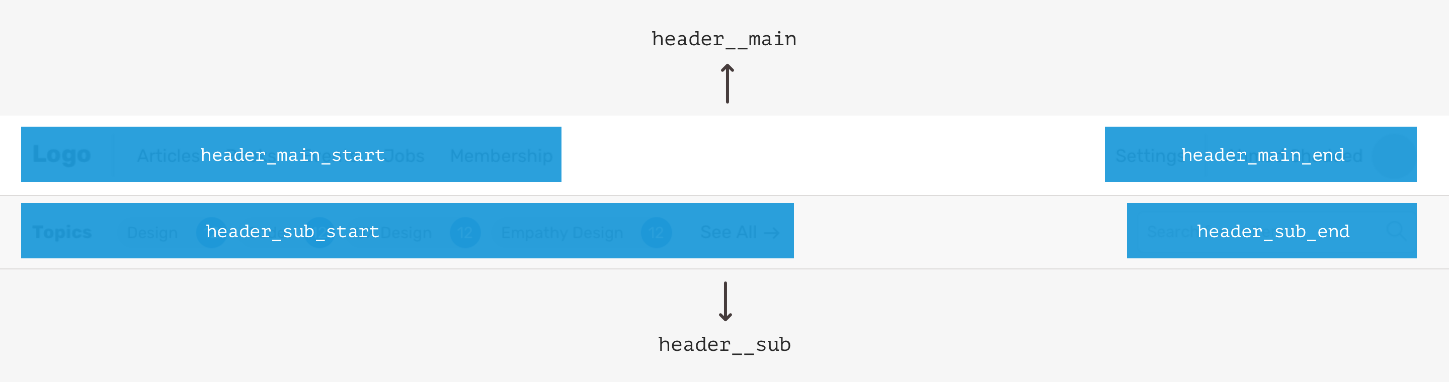
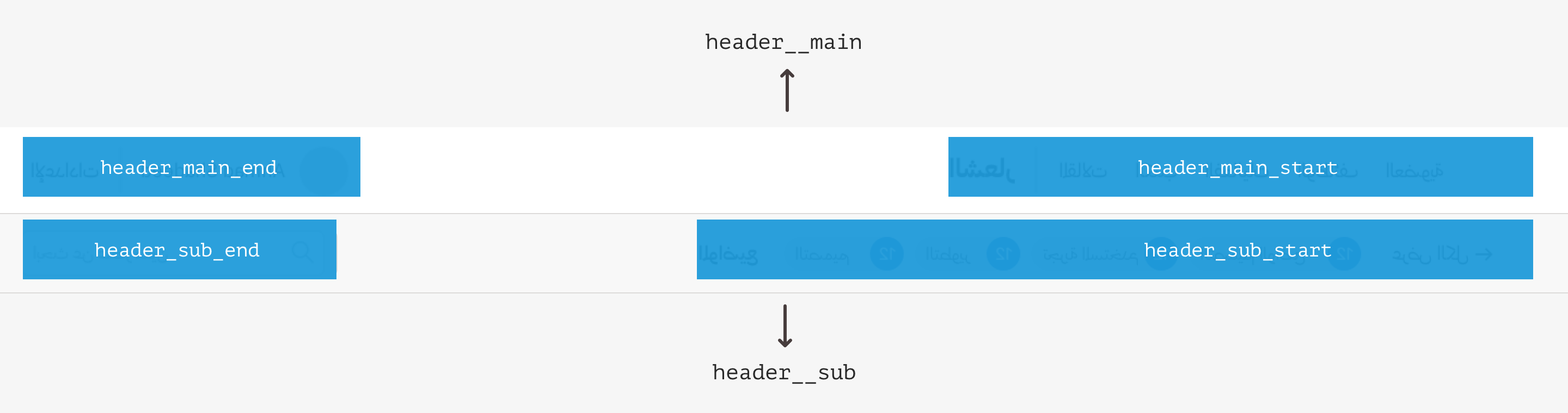
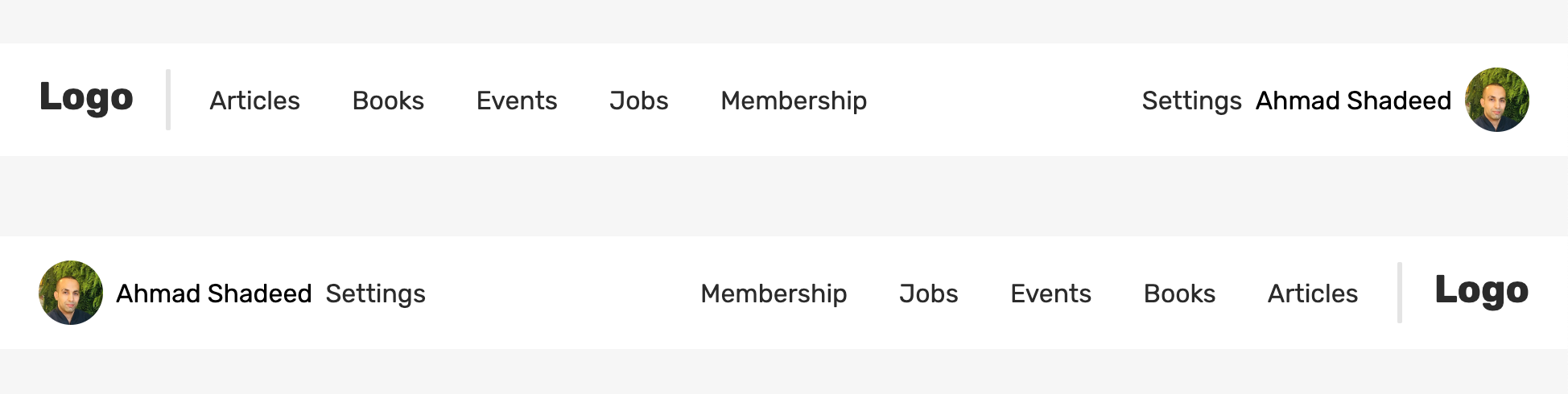
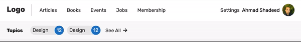
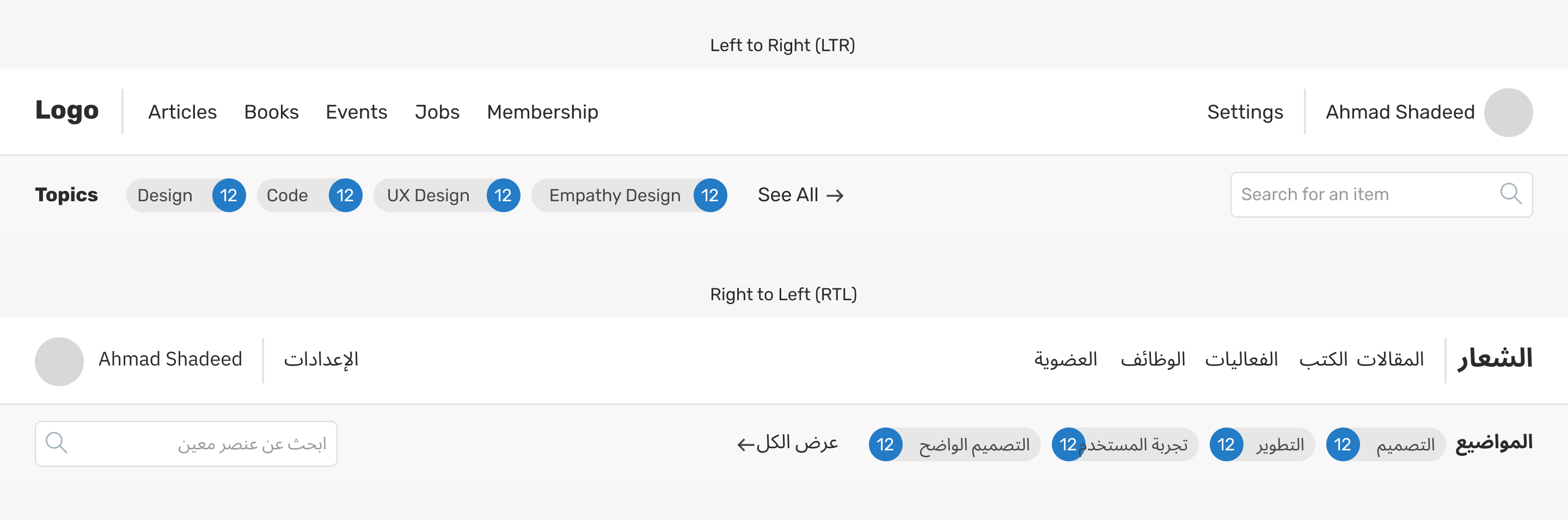
I’ve designed a layout specially to show you how I would approach and think about flipping it to a RTL layout.
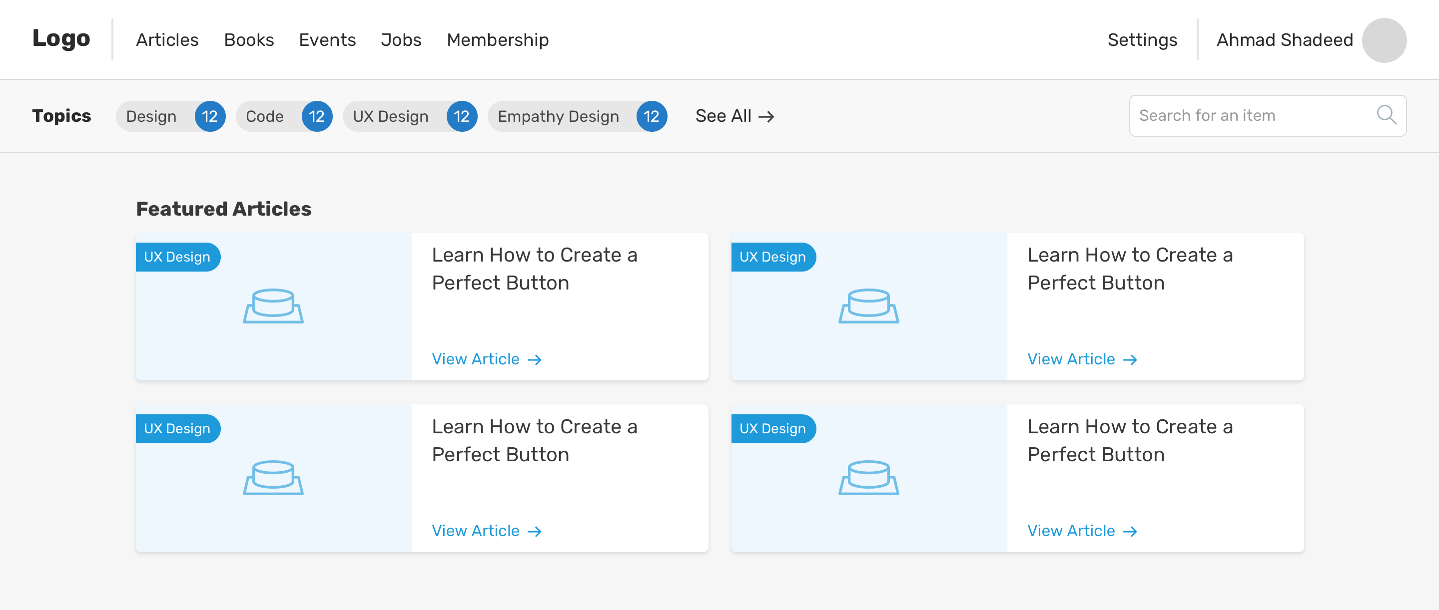
Let’s start with the header component. To code it properly, I’ve outlined a general skeleton. Notice that I’ve divided the header into a main section and subsections. Also, I’ve added start and end classes for the sections.
.header__main,
.header__sub {
  display: flex;
  justify-content: space-between;
}
And because CSS flexbox works based on the direction of the page, as explained previously in this guide, it will flip automatically for RTL.
The next thing is the dividing line between the logo and navigation. At first, I thought about using border-right. It works but is not ideal. Using a pseudo-element would be better because it will flip based on the page’s direction.
.c-brand:after {
  content: "";
  display: inline-block;
  vertical-align: middle;
  width: 3px;
  height: 38px;
  border-radius: 5px;
  background: #e4e4e4;
  margin-inline-start: 1.25rem;
}
Here is the result so far:
Next, I’ll work on the topics component (the one in the subheader with labels and counters). Here is a design mockup of how the topics component should look in LTR and RTL. Notice that the placement of the counters is different.

It might seem simple at first, but multiple declarations of padding and margin need to be handled between LTR and RTL. Here is a mockup illustrating that:
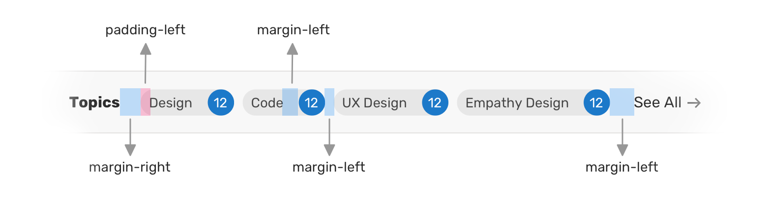
.topics-heading {
  margin-inline-end: 1.5rem;
}

.topics-list {
  margin-inline-end: 1rem;
}

.c-topic {
  padding-inline-start: 0.5rem;
}

.c-topic:not(:last-child) {
  margin-inline-end: 10px;
}

.c-topic__counter {
  margin-inline-start: 1rem;
}
As you can see, I’ve used CSS logical properties, instead of left and right.
The next step is the “See All” link. Notice the arrow at the end of it. Below are its requirements:
- The arrow’s color should change on hover.
- The arrow should animate to the right on hover.
I chose to use inline SVG for this purpose. When I added a translate animation to the arrow, I thought about RTL. There is no logical property for this, and I needed to explore other solutions. One solution I came up with was to animate the margins.
.c-link svg {
  margin-inline-start: 4px;
  transition: 0.15s ease-in;
}

.c-link:hover svg {
  margin-inline-start: 8px;
}
But animating margins is not good for performance, although it works. The other solution is to detect the page’s direction, and set the translate declaration based on that.
.c-link:hover svg {
  transform: translateX(6px);
}

/* I’m using dir=rtl in the header for the purpose of clarity. It should be added to the root element. */
.c-header[dir="rtl"] .c-link svg {
  transform: scaleX(-1);
}

.c-header[dir="rtl"] .c-link:hover svg {
  transform: scaleX(-1) translateX(6px);
}
Notice that for RTL, I’ve added scaleX(-1) to flip the arrow icon horizontally. You could use rotate(180deg) instead, but the scale is more straightforward to me.
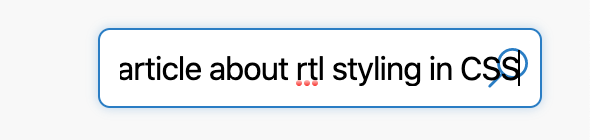
Next is the search input. Here are the requirements:
- A search icon must appear at the end of the input element.
- The placement of the search icon must be dynamic.
.c-input--search {
  background-image: url("data:image/svg+xml...");
  background-position: right 6px center;
}

.c-header[dir="rtl"] .c-input--search {
  /* We replace the original icon with a flipped one. */
  background-image: url("data:image/svg+xml...");
  background-position: right 6px center;
}
Also, when the user types in the search box, the text shouldn’t slide under the icon. To avoid this, add padding on either the right or left side.
.c-input {
  padding-inline-end: 32px;
}
Here is the result thus far for both LTR and RTL:
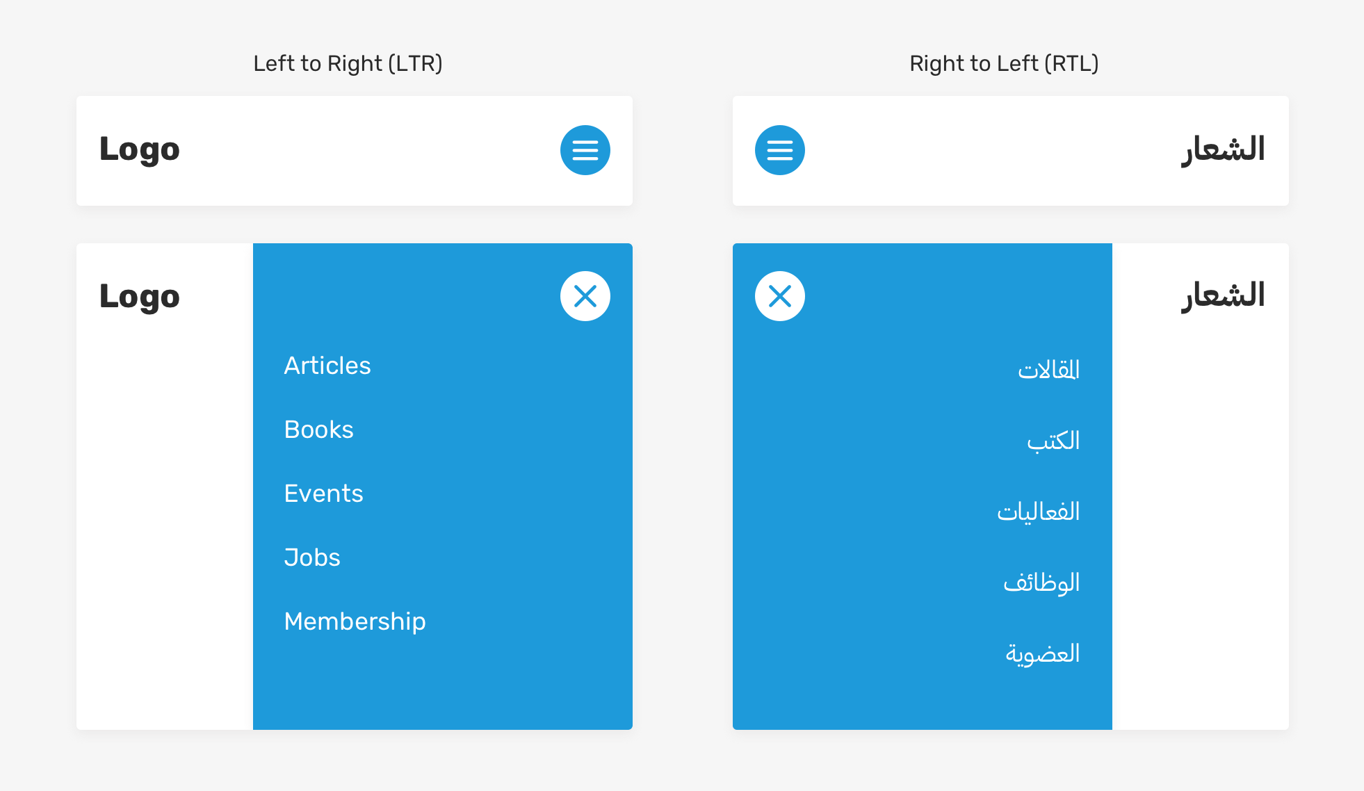
Next is the mobile menu. I will use a hamburger icon to indicate the menu. The placement of the icon will change between LTR and RTL. The same goes for the direction of the translate animation.
Check out the demo on CodePen.
Thanks #
Special thanks to my wife, Kholoud, for her continuous support and for reading the guide multiple times. Thanks to both Adebiyi Adedotun Lukman and Šime Vidas for their amazing feedback.
Resources and Related Articles #
- (Right to Left (The Mirror World
- Let’s Talk About RTL
- Basic Concepts of Flexbox
- Basic Concepts of Grid Layout
- Right-to-Left Development: Tips and Tricks
- Arabic Numerals